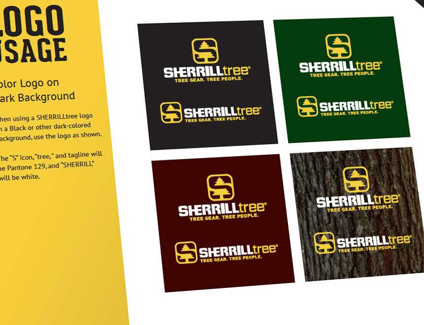
The SHERRILLtree brand was strong, but needed a color refresh, and some guidelines to ensure all creative remained on-brand. The previous color palette used some nice earthy tones, but lacked the visual punch needed as SHERRILLtree embarked on launching their own lines of products.
I kept the prior colors on as accent colors, and chose a pleasant yellow that really worked well with the existing logo, had great visual impact on packaging, and felt like an evolution of the SHERRILLtree brand.
Once I had the look I wanted, I put together a brand book that not only explained the technical details of the branding, but serves as an example of SHERRILLtree's overall style.