





Ice-O-Matic Rebrand
Brand voice, logo design, brand colors, typography, brand guidelines, collateral.
When Ice-O-Matic approached its rebrand, the company had already spent several years changing the way it worked and thought about its business. Those improvements were beginning to show results. The goal was to create an identity that reflected the company it had become and signaled that change to the world.
I led the project and traveled to Ice-O-Matic’s headquarters in Colorado to tour the facility and meet with its marketing team. I ran a branding exercise that helped us identify three tenets to guide the work: Pioneering design. Built to endure. Trusted to deliver. Those ideas gave me a clear starting point for the new logo.
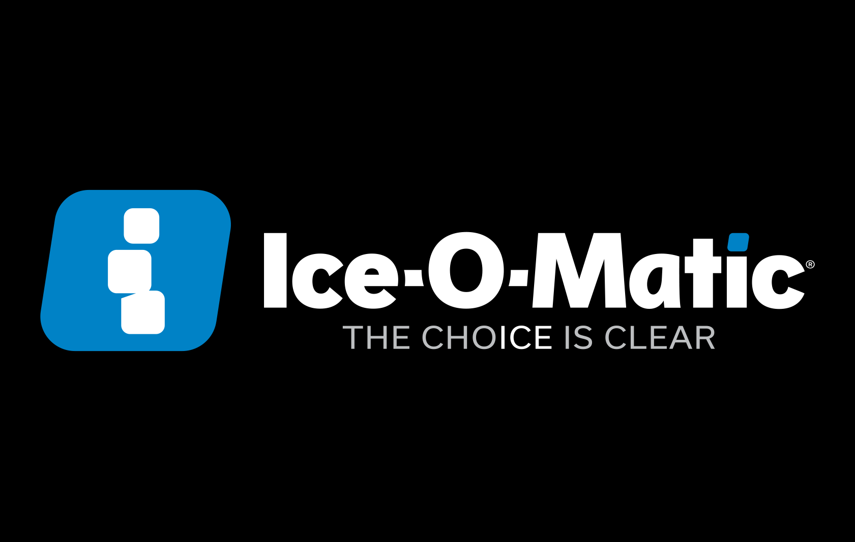
There was one important constraint: the identity needed to feel new while remaining recognizable to people who knew the old logo. I kept its three-cube icon, rotated it 180 degrees, and redrew the cubes to form a lowercase “i.” I chose a typeface that felt related to the original wordmark and carried over its distinctive “A.”
From there, I looked for ways to make the identity more specific to Ice-O-Matic. I placed the “i” inside a slanted shape based on one of the company’s most popular ice cube shapes, then used that same shape to dot the “i” in “Matic.” The second “C” in the wordmark contains a subtle nod to Colorado’s “C.” In the tagline, “The Choice Is Clear,” a slight color change picks out the letters i, c, and e.
The three brand tenets informed the finer decisions, too. I wanted the logo to feel modern and inventive, with bold lettering that would endure. I carefully adjusted the spacing and letterforms so the mark felt balanced and worked as a whole. A mid-tone blue gave it a calm, confident feel. Above all, it needed to read clearly as the identity of a company that makes ice machines. When people see it, I want them to think of ice.
The workshop made the design process unusually direct. I developed concepts while I was still in Colorado and presented them to the marketing team and company leadership. We even refined some of the details together, live on a conference room screen. By the time I left the next day, they had submitted the concept to their parent company for approval. I then completed the final refinements and supplied the logo files and brand guidelines.
Ice-O-Matic’s marketing team led the companywide rollout. Seeing the identity appear on everything from the building to the ice machines has been rewarding. I’m proud to have helped give visible form to improvements the company was already making.

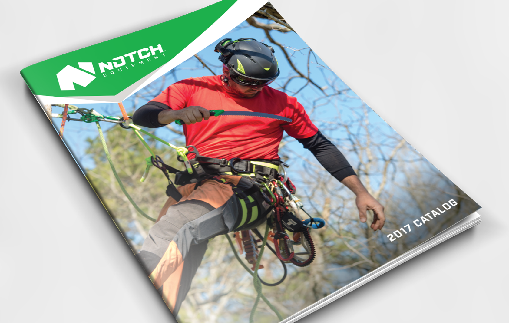
Notch : At-height tool manufacturer
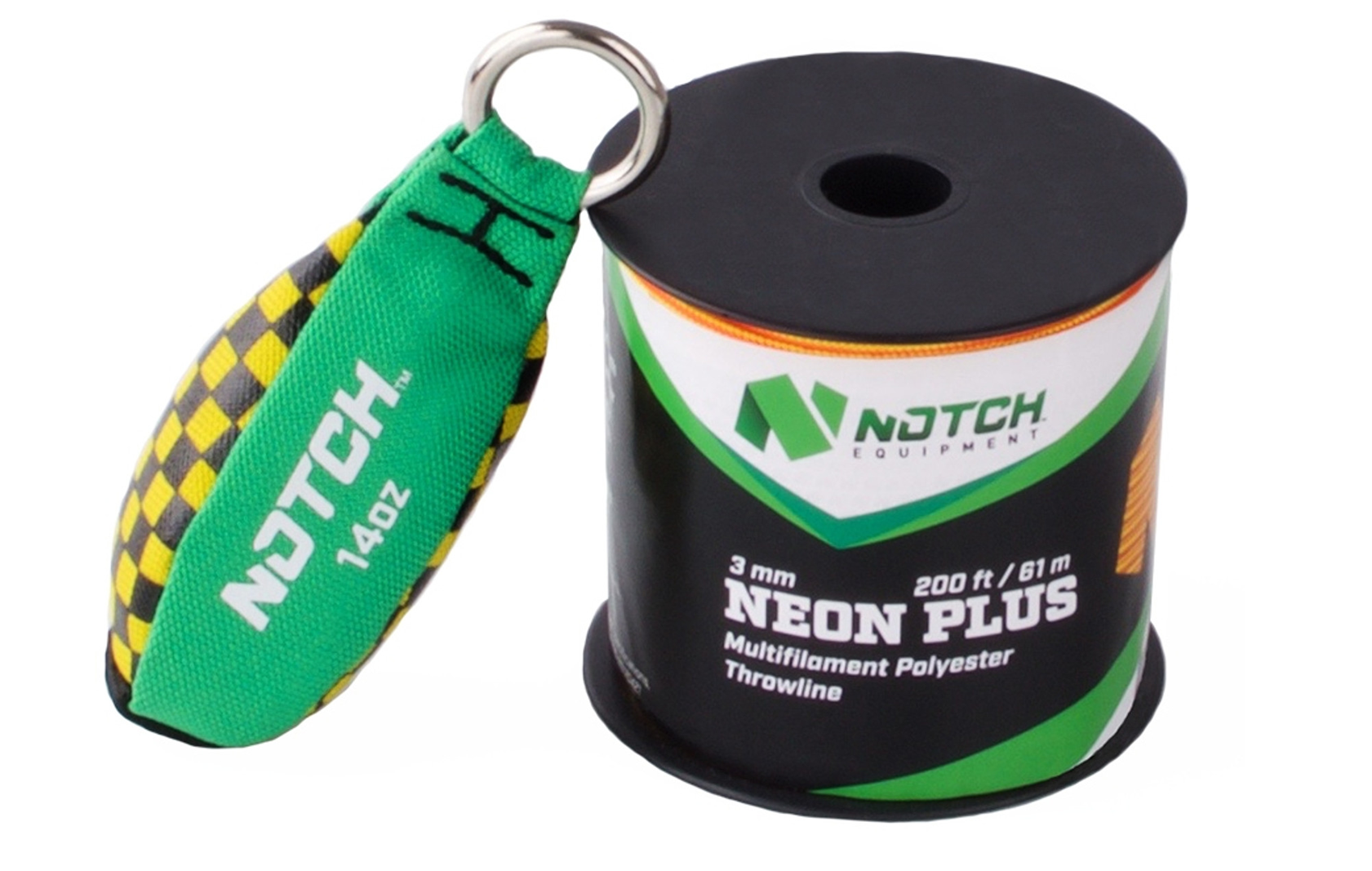
Brand name, brand voice and messaging, logo design, brand colors, typography, brand guidelines, product marking, packaging, collateral.
Comprehensive brand project for a manufacturer of at-height equipment, beginning with the name. I achieved the goal of a simple, one-syllable name that resonated with the consumer base and was trademarkable.
The logo was designed to convey strength and kept simple so it could be reduced for product markings. A medium, bright green was chosen for it's uniqueness in the tool market and it's connection to the environment, safety and positivity.
The brand voice and messaging was established to be direct and informative, and to champion proper safety measures in the dangerous at-height professions.
Brand guidelines were created to ensure consistent branding across internal uses, and the external dealers selling the Notch line of tools.



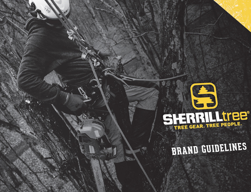
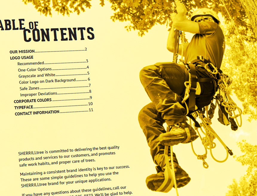
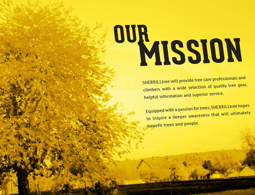
SherrillTree : Tree tool retailer
Brand voice and messaging, logo design, brand colors, typography, brand guidelines, product marking, collateral.
I developed the logo and was a steward of the brand, making sure it always reflected the core values of the company.
This voice was established to be down-to-earth, earnest and helpful. Writing was always done in laymen's terms, and real-world examples and insights were used as much as possible.
All catalogs, collateral, web, and event creative were designed with the brand voice in mind.


Breakers : Hockey Team
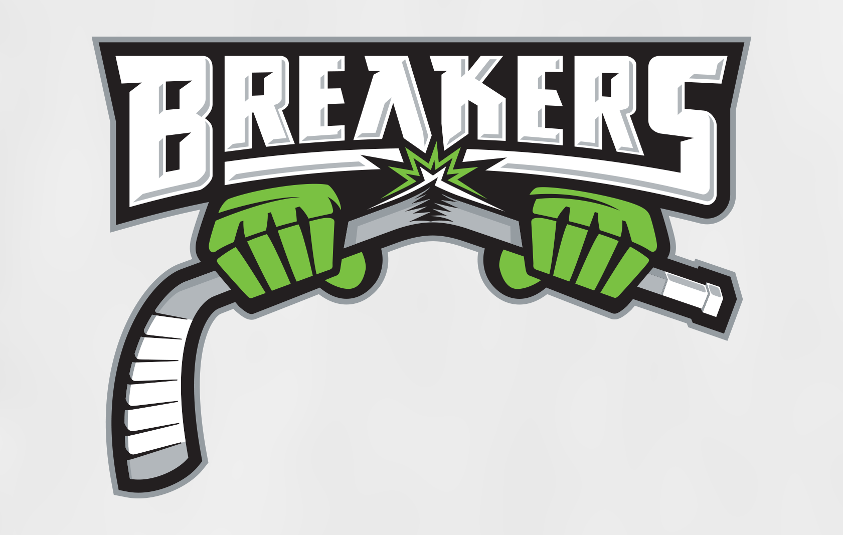
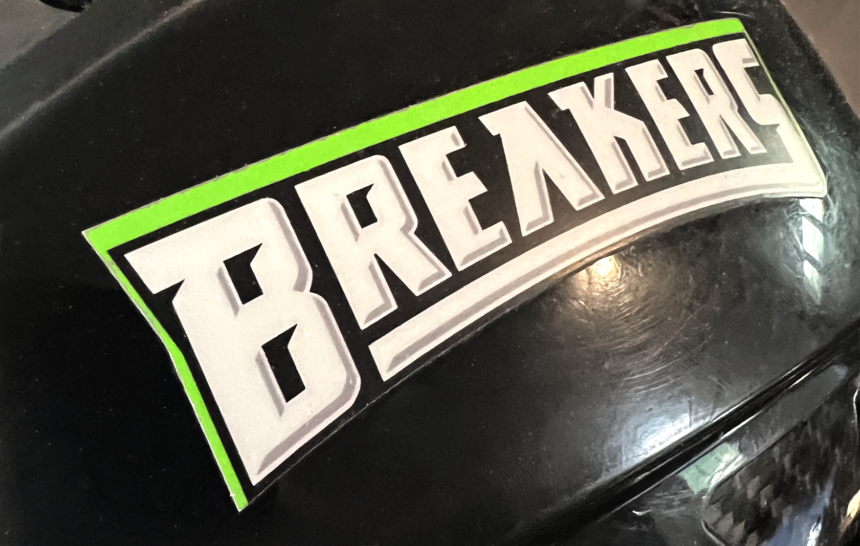
Logos (primary and tertiaries), colors, typography, uniform design, merchandise design.
Complete redesign of the team's brand. The color scheme was updated to a sleek black and neon green with silver highlights.
The uniform was designed and then sourced from a manufacturer, requiring custom green fabric to be created.
The final part of the project was the design of team merchandise, using a mixture of the primary and tertiary logos.



ClimbStuff.com : Rock Climbing Gear Retailer
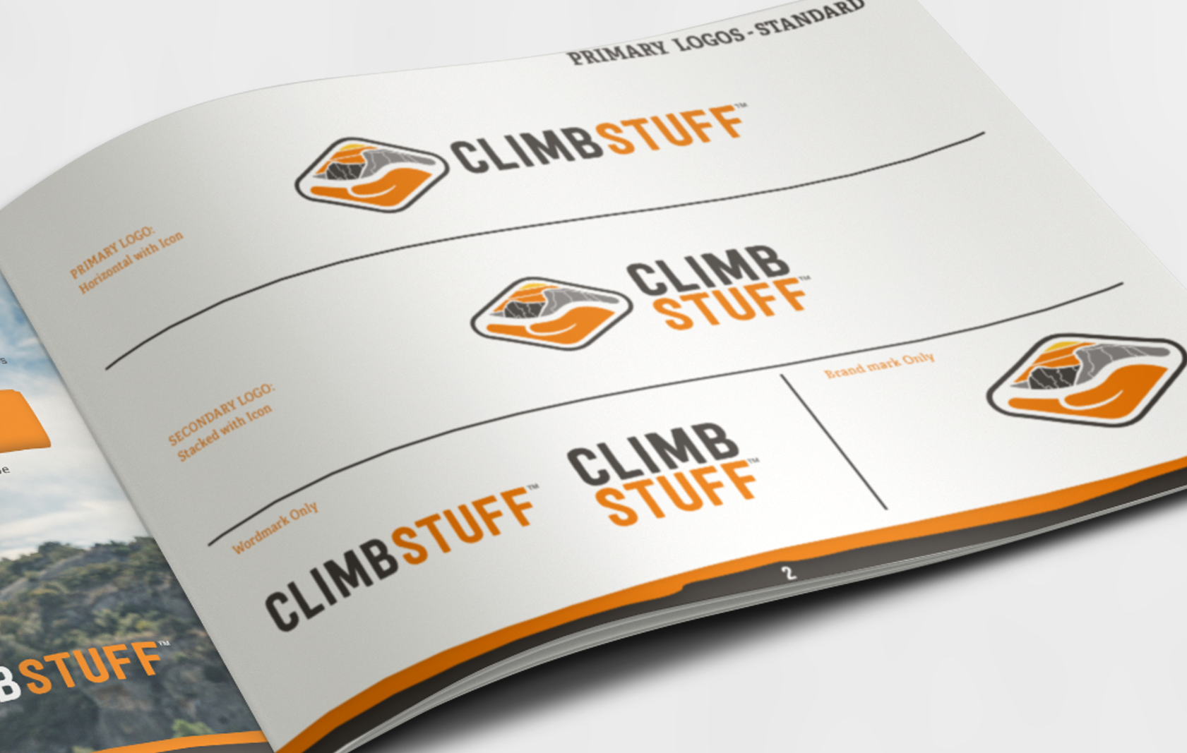
Logo development, brand guidelines
I helped develop the logo for ClimbStuff, and wrote the brand guidelines to establish its look and feel, and convey the brand's messaging. They intended to be a premier supplier and lifestyle brand within the rock climbing market.