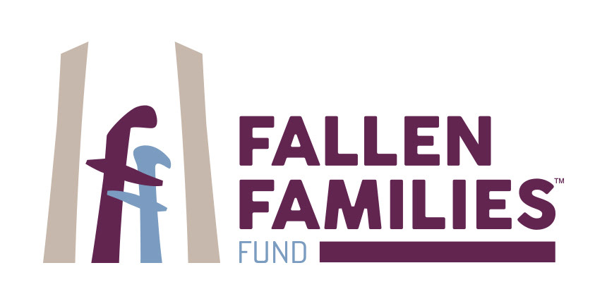
When we brainstormed the Fallen Families logo, we determined it needed to be something that had an emotional connection, that represented support and caring. We also wanted to design it in a way that could connect to the viewer, regardless of which at-height industry they work in, be it tree care, tower work, window cleaners, etc.
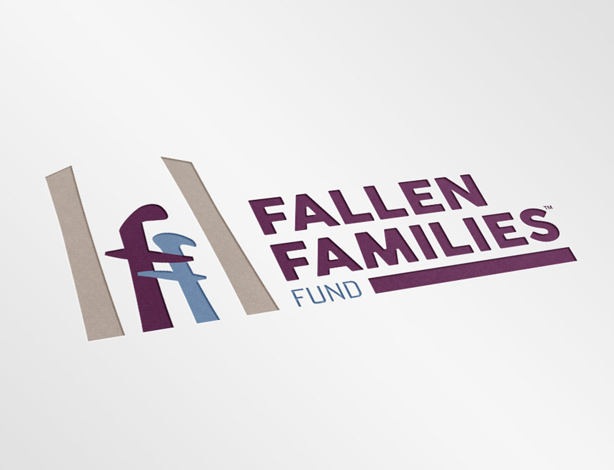
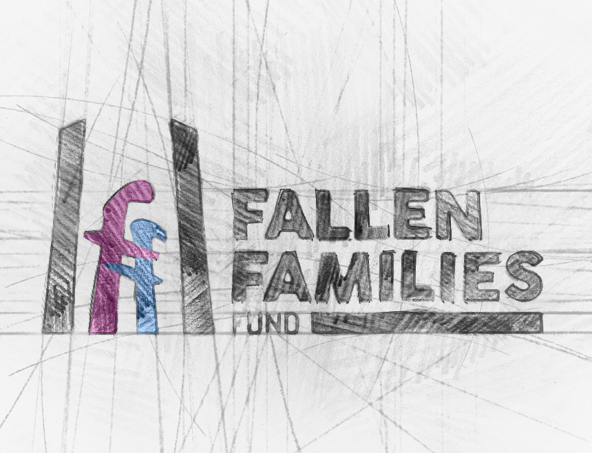
The very first aspect we worked on was the brand mark. I had the idea to humanize two lowercase f's, personifying a parent embracing a child.
The brand mark also needed to reference the at-height industries the charity serves. This was also tricky, but I found the solution with two simple pillars that frame the F's. The pillars are capped with perspective angles and were given a neutral tan color. The pillars communicate the vertical industries, without specifically relating to one over another. In fact, the viewers read the pillars as whatever industry they come from. Tree guys see tree trunks, tower workers see the base of a tower, and so on.
For the word mark, I wanted a font that was bold, with some softness to it. We went with Cocogoose Regular as the base, and I softened it up a bit more by rounding off most of the corners.
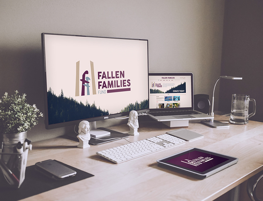
Visit FallenFamiliesFund.com for more information on the charity.