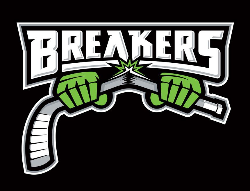
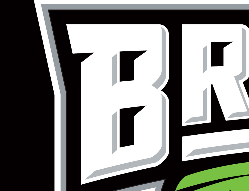
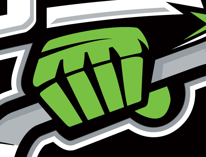
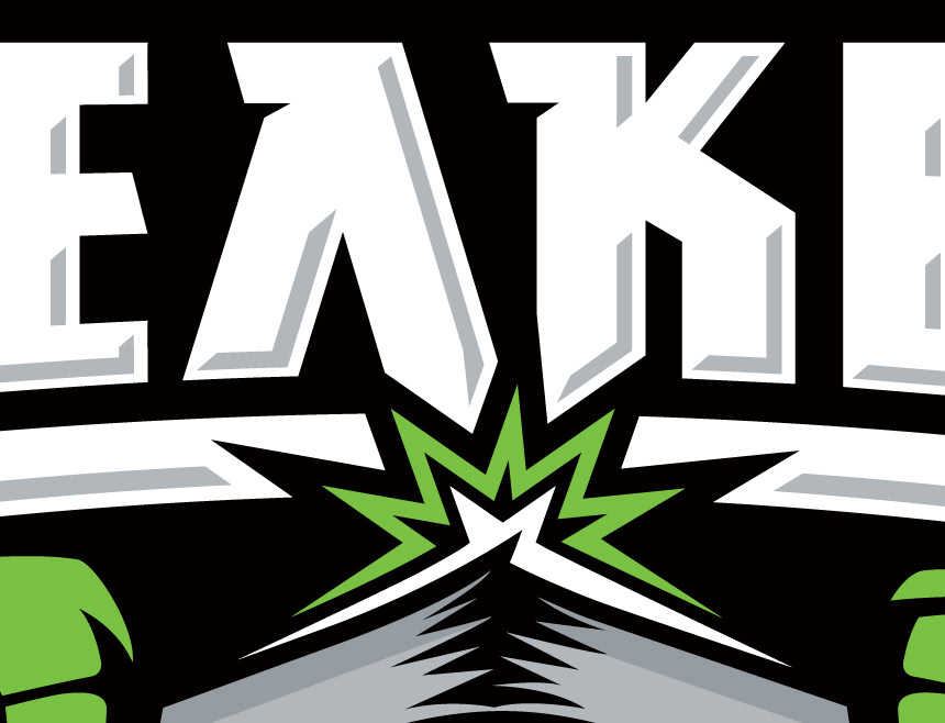
The Breakers old logo had the iconic fists breaking a hockey stick. I wanted to keep that as a main element of the logo, and build off of it. I updated the styling of the fists and stick, and added the impact of the break itself, which interacts with the type in the logo.
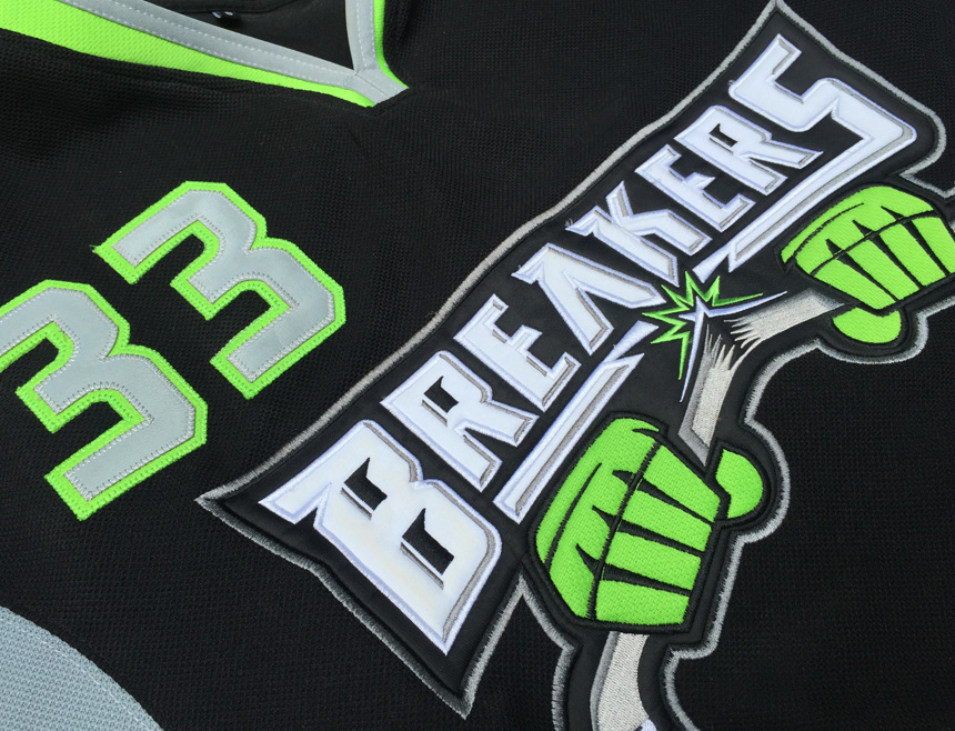
The uniform design was to be a modern looking jersey, keeping in mind that the styling was influenced by the Seattle Seahawk's look and feel. Custom dyed fabric had to be ordered to get the green we wanted, but the result was worth it.
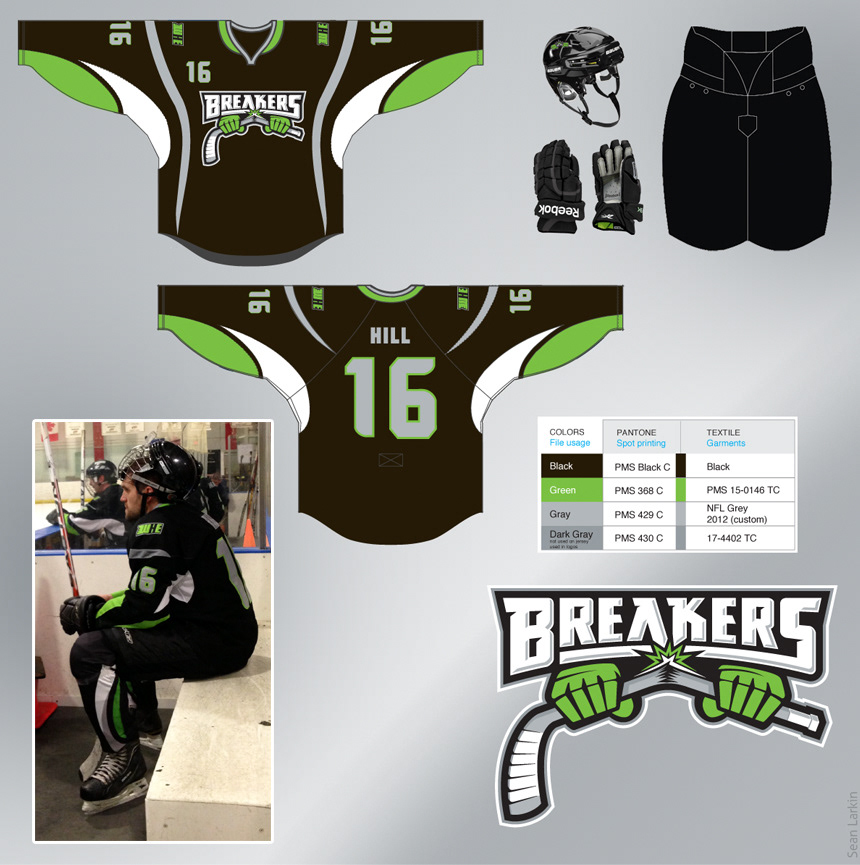
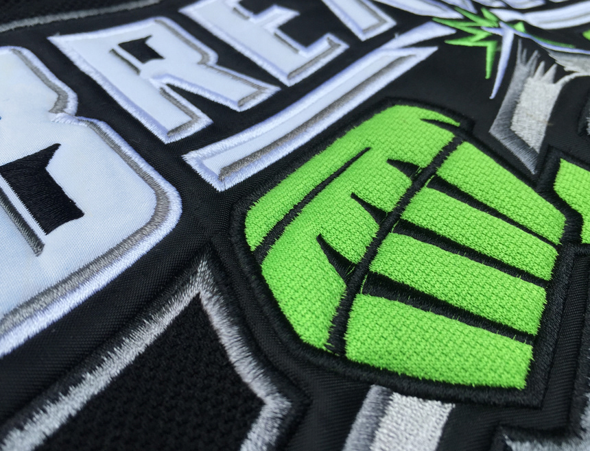
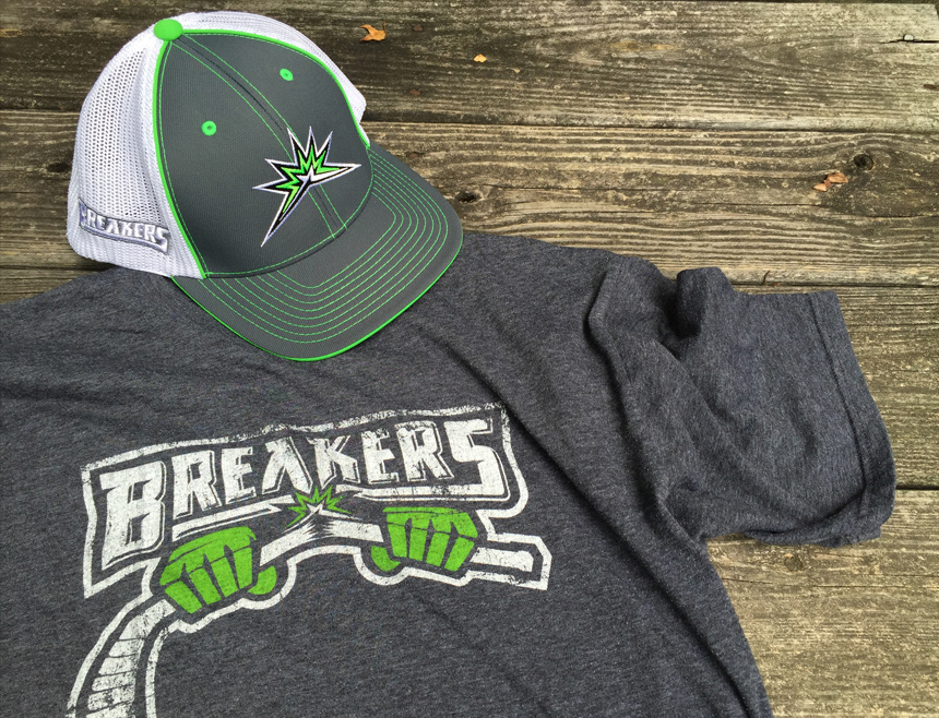
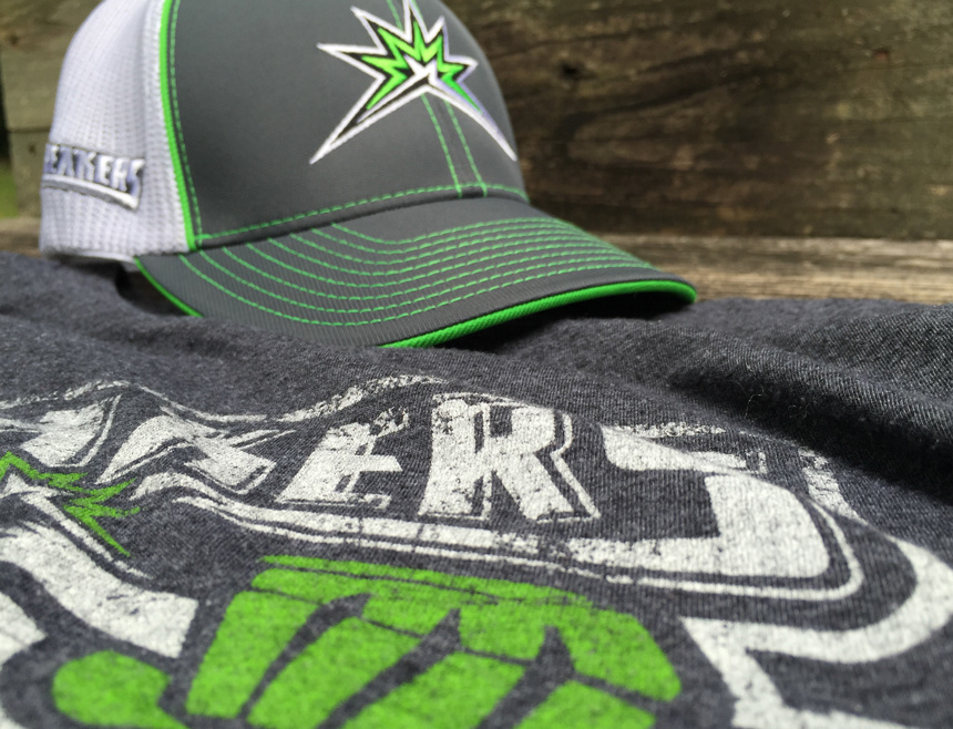
Breakers merchandise ranges from hats, shirts, stickers and more. The break element of the logo serves as the team's secondary logo.