ART is a well known manufacturer of mechanical devices for rope climbing. Based out of Germany, their tools are known for being high-end both in design and function. In 2016, ART is releasing their first new product in almost 5 years, called Spiderjack 3. They wanted to start promoting the new device immediately, in trade magazines, catalogs and online.
Using minimal elements from ART, I developed a very simple theme that utilizes a slight super-hero movie poster aesthetic, that will be used across all mediums.
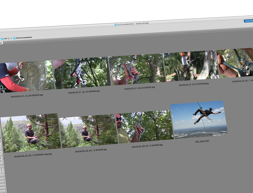
When I say "minimal elements", I'm referring to the very small amount of input to work with. I was supplied with standard product photos that were a decent resolution, and a handful of in-use photos, that were all low-res screen grabs, except for one RAW file of a climber swinging through the air.
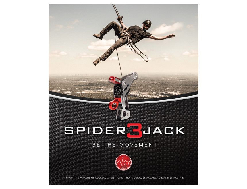
The photo of the climber swinging through the air caught my attention instantly. His body language, positioning, and expression gave me the super-hero vibe, which led to the campaign concept. I scoured the internet for super-hero photos, most of which follow the modern trend of dark and gritty. While in its own context, the dark and gritty look works, it wasn't a fit for what I wanted to do.
Ultimately, the Spiderjack 3 is the star of the campaign, so I desaturated the photo a bit, and boosted the contrast, in addition to a few other slight tweaks. The end result was a tough, gritty photo, that doesn't feel ominous or steal the show.

Once I had a good idea of how the photo was going to look, and the concept off and running, I looked to add a texture to the aesthetic that would be used to fill any gaps or act as a background in larger pieces.
To build on the super-hero concept, I looked for a texture that resembled the materials used for super-hero uniforms in modern movies. I found one and added a curved trim-line to it, and adjusted the color as needed.
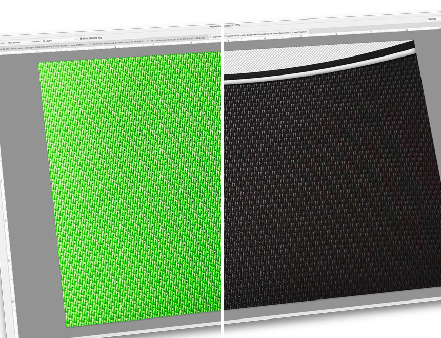
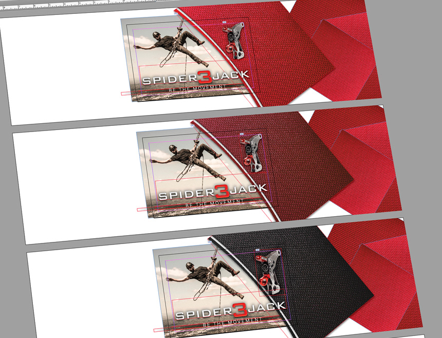
The used a half-page print ad as my starting point, as it's the most challenging in terms of fitting all the elements in the ad. ART's color scheme is red and black, so I played around with those colors for the texture. I decided on the black because the silver and red of the Spiderjack 3 looked best on the black, plus any text placed on the black would read better.
While working through the aesthetics, I was also writing taglines. The Spiderjack 3 is is a device used to ascend and descend a rope, and is ultra responsive to the user. I narrowed my choices down and ultimately decided on BE THE MOVEMENT. It's short, it's related to the products responsiveness, and hopefully gives people the feeling that they're a part of ART's resurgence in the industry.

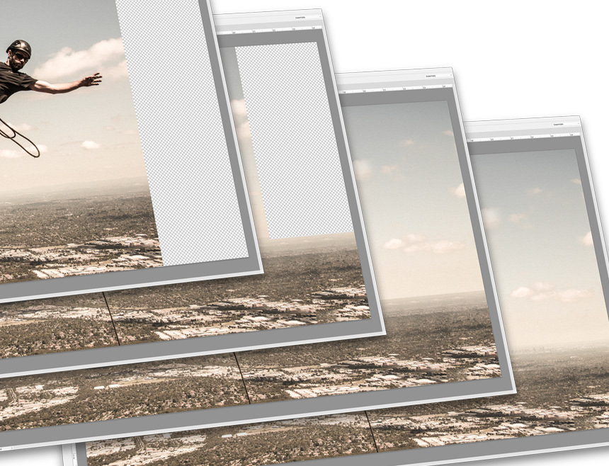
Once everything was completed, with the tagline in place, and product photo dropped in, the last bit of house cleaning was to create a centered version of the super-hero photo, as he is way off center in the original. It worked OK in the half page ad, but for bigger pieces, I needed him centered, so I got into the Photoshop and extended the right side of the photo.
This is how the elements were arranged for a full page print ad.
